Voyager
An AI Travel Companion
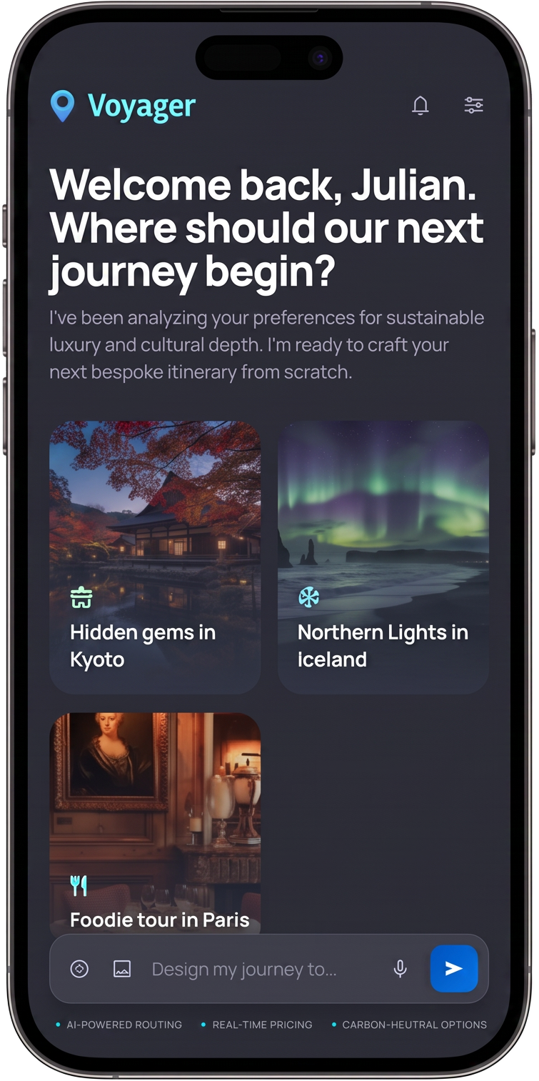
Design lab AI for UI Project: designing a travel AI product end to end, using AI at every stage.
Role
Product Design, Concept, End to end, Problem Framing, AI product strategy
Timeframe
4 weeks
Tools
Perplexity, Claude, ChatGPT, Google Stitch, Figma, Figma Make
Tasks Performed
0→1 Design, UI/UX Design, Interaction Design, AI product strategy, Market analysis
Overview
Voyager AI is a travel-planning product for people who love to travel but hate the planning. I took it from a blank page to an investor-ready pitch on my own, and I ran AI tools through every stage of the work: discovery research, competitive and market analysis, ideation, hi-fi design, usability testing, and a full pitch deck.
I had two goals. First, to find out how far AI could compress a complete product design process without the output turning generic. Second, to show something I believe is true about this role: design and business are the same conversation. A designer who can go from a user problem to a fundable product story is worth more to a startup than one who stops at the screens.
The source material for this case study runs to four documents and dozens of pages. This page is the short version. If you want the depth, the phase decks and the pitch deck are linked at the bottom.
Design
Using AI across the design process
I did not use one AI tool for everything. I used each one for the thing it was actually good at, and I kept the judgment for myself.
Discovery
I started with brand and positioning: a moodboard, a color system, logo directions, and early personas for the "time-strapped professional" I was designing for. AI was useful here for fast exploration and for synthesizing scattered inputs into something I could react to. The taste calls were mine.
Research and ideation
This is where AI earned its keep and also where it needed the most supervision. I built a competitive analysis, a feature-gap breakdown, and a first-pass market opportunity model. I wrote survey and user-needs questions, mapped the end-to-end journey, and pulled out the priority pain points that would drive the design. Crucially, I fact-checked every market claim the AI produced against primary sources, and I ended up with a short list of five verified citations. More on why that matters below.
Execution and testing
I moved into hi-fi screens and prototyping, then ran the flows against the pain points I had identified earlier, so the design was answering real problems rather than decorating a wireframe.
The business layer
Alongside the product, I built a complete investor pitch: the problem and solution framing, market sizing with TAM, SAM, and SOM, a pricing model across consumer and B2B tiers, user-growth and financial projections, a go-to-market plan, a value proposition canvas, and a risk register with named owners and mitigations. This is the part most design case studies skip, and it is the part that changes how the design reads. When you have to defend a pricing tier or a go-to-market bet, your product decisions get sharper.
Company
Designing it as a company, not a screen exercise
I did not treat Voyager as a set of screens. I treated it as a company. I sized the market, chose a wedge (busy professionals who travel a few times a year), and priced against it. I mapped a value proposition canvas so every pain had a named product response and every job had a direct feature. I wrote a risk register covering the recommendation-quality risk, the incumbent-response risk, and the free-to-premium conversion risk, each with a mitigation.
None of this claims to be the final answer. What it reflects is a way of working: holding the product view and the business view at the same time, so the design decisions are grounded in why the product exists and how it would sustain itself. On a small team, that overlap tends to be where a designer is most useful.
Tips and tricks
Things I would tell any designer picking up these tools:
- Match the tool to the task. No single model is best at everything. Research synthesis, strategy, microcopy, and UI exploration all have a tool that does them better than the others. Forcing one tool to cover all four is how you get mediocre output four times over.
- Fact-check everything the AI tells you about the world. Market sizes, growth rates, and survey stats are the exact kind of thing AI will state confidently and get wrong, and it will invent a source to match. I verified every number against a primary source. If a claim is going in front of an investor, it needs a real citation behind it.
- Feed it your framework, not just your question. Hand the AI the actual method you work in, a value proposition canvas, an NN/g goal hierarchy, a journey-map structure, and the output comes back in a shape you can use instead of a shape you have to rebuild.
- Use it for the first 70 percent, keep the last 30 for yourself. AI is fast at breadth and drafts. Hierarchy, taste, edge cases, and the decision about what to throw away are still the job. That last 30 percent is where the design actually gets good.
- Prompt for reusable structure. Ask for personas, comparisons, and tables in a consistent format up front. You will spend far less time reformatting and far more time thinking.
- Argue with it. Ask the model to make the counter-case, poke holes in your positioning, or tell you why an investor would pass. It is a decent sparring partner as long as you do not mistake it for a decision-maker.
Pros and cons
What worked
- Speed. Work that would normally take weeks and a small team compressed into a few focused days.
- Breadth on my own. As a solo designer I could cover research, strategy, and the business case that would usually be spread across three roles.
- More directions, lower cost. Exploring a fifth or sixth option stopped being expensive, so I explored more before committing.
- A strong first draft, fast, for microcopy, competitive scans, and market framing.
What did not
- Confident and wrong. Hallucinated statistics and fabricated citations were a constant risk, which is exactly why the fact-checking step was not optional.
- Output drifts to the average. Left alone, AI produces the "top 10 list" version of everything. It takes a designer to push it past the obvious.
- It cannot do the human parts. It will not sit with a real user, feel where a flow breaks, or own a taste call. Those stayed with me.
- Easy to skip the thinking. The biggest risk is letting the tool do the reasoning instead of just the typing. The work is still yours to own.
Tools by Stage
| Stage | Tool(s) | What I used it for | Reliability |
|---|---|---|---|
| Discovery and user research | Perplexity, Claude | Synthesizing sources, framing personas and user needs | Very high |
| Market and competitive analysis | Scholar GPT, Perplexity | Market sizing, competitor scans, sourcing | High to very high |
| Fact-checking and citations | Perplexity | Verifying every market claim against a primary source | Very high |
| Strategy and product thinking | Claude | Value proposition canvas, positioning, GTM, risk framing | Very high |
| Microcopy and content | ChatGPT, Claude | UI copy, loading states, empty states, labels | High to very high |
| UI exploration | Google Stitch | Fast layout and screen exploration | High |
| Hi-fi design and prototyping | Figma Make | Exploration through to hi-fi screens | High |
End Product
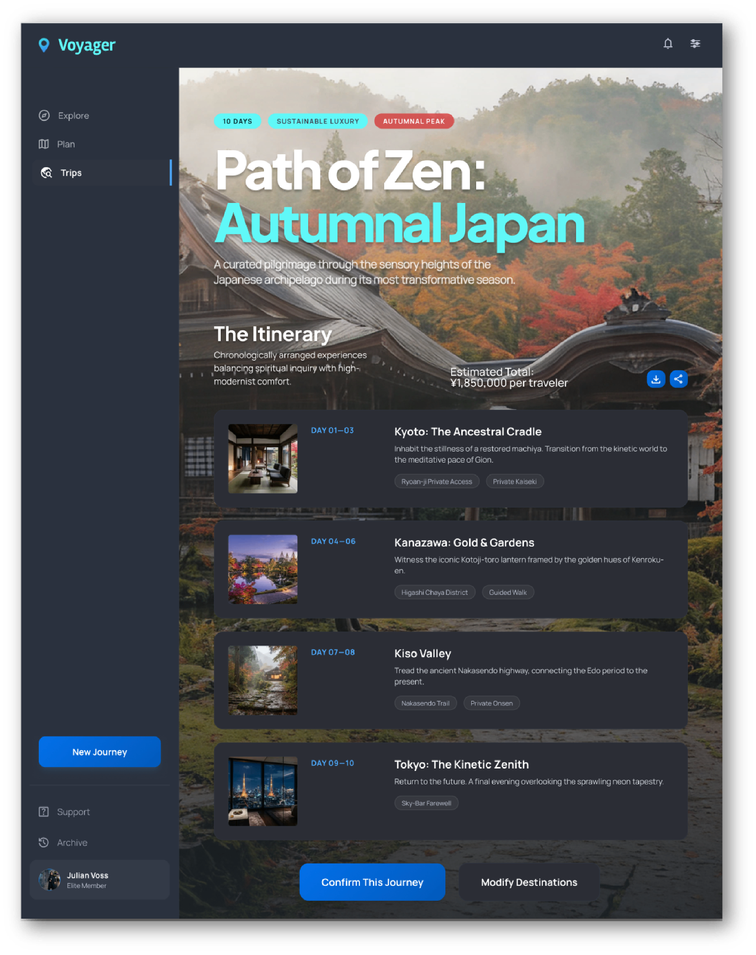
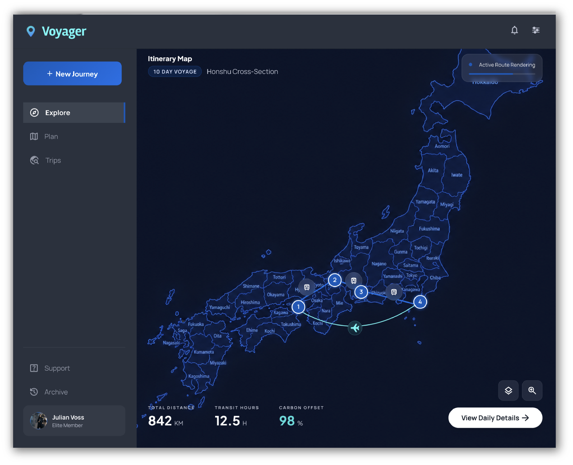
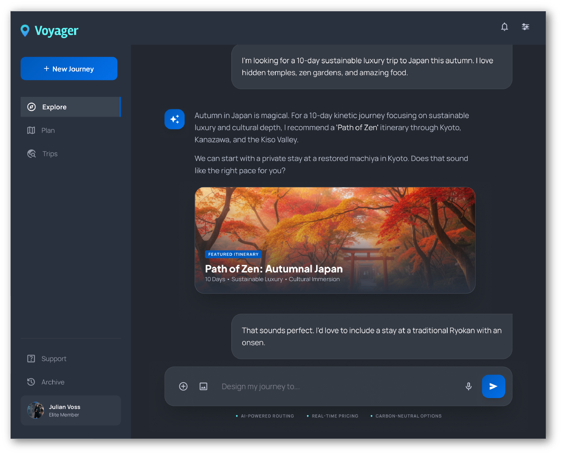
Takeaways
- AI compresses the process. It does not replace the judgment. The value is in what you point it at and what you have the taste to discard.
- The designer's edge has moved. Producing artifacts is now cheap. Deciding which artifacts matter, and verifying what the machine hands back, is the skill worth paying for.
- Doing the business case made the design better. Every time I had to defend a price or a growth assumption, a product decision got clearer. The two disciplines are not separate.
- For a startup, this is a force multiplier. A designer who can run research, ship the product, and stand up a credible business story covers a lot of ground for a small team.