Notifications Management
Organizing and managing notifications to granular level
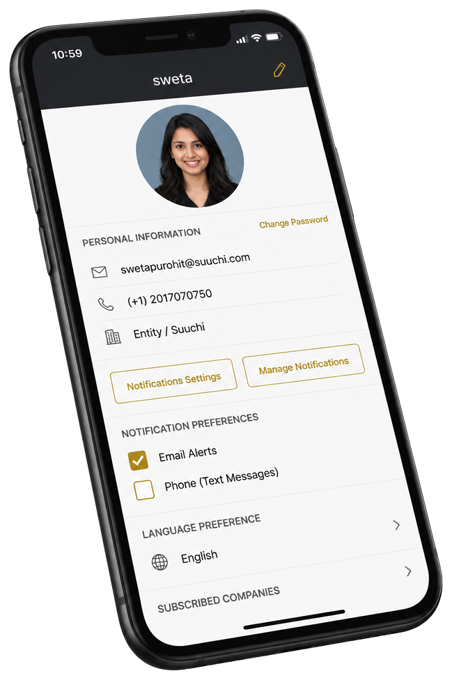
IMPACT
At a glance
When every event fires a notification, the important ones disappear. On the Grid PLM, that meant missed alerts turning into missed production deadlines. By giving users precise, role-aware control over what reaches them on mobile, we cut the noise without cutting the signal and the downstream deadline and satisfaction gains followed.
-38%↓
Missed deadlines
64% → 7%↓
Irrelevant Notifications Reduced
-84%↓
Reduction in missed alerts
+6
User Satisfaction
Role
Design Lead
Timeframe
2 Weeks
Tools
Sketchbook & Pencil, Whiteboard, Adobe XD, Miro,
Tasks Performed
0→1 Design,User Research, UI/UX Design, Component Design,Interaction Design, User Flows, Wire-framing, Prototyping, Usability Testing, Design Handoff, Collaboration with Product, Engineering, and QA teams.
Overview
Context
The GRID is end-to-end supply chain visibility from product conception to distribution with real-time updates and analytics on sourcing, product development, production, and shipping. For companies running their supply chain on Excel sheets and point solutions, the GRID functions as the ERP and as an intuitive supply chain productivity layer. For companies that have legacy PIMs and ERPs, the GRID integrates to connect people, data, and workflows. In either role, the GRID delivers quick time to value by eliminating errors and digitizing manual processes thereby reducing OpEx and COGS and improving margins.
The Problem
Throughout the product lifecycle process there are different types of notifications received by clients and the staff handling the project via email, push notification, or text message. Currently there is no way to manage the different types of notifications clients and staff receive, as users may or may not want to receive certain notifications 1. Users getting so many spam notifications 2. Important notifications for their job getting lost resulting into delays and missed deadlines 3. Users need only selective set of notifications which are important for their job responsibilities
Goal
As a solution to the problem, we are providing an easy way to manage notification preferences at all levels from Product, Company, Files, Comments, Product Development phases and stages, Vendors, Billing, etc. so users can avoid unwanted notifications while still receiving those crucial to their day-to-day responsibilities of handling the product lifecycle efficiently. The goal is to give users flexibility and control on subscribing to the notifications which are useful and important for their job. 1. Provide different user types ability to pick and choose the notifications that they would like to receive 2. Serve users ability to choose the notifications that they would like to receive per module and per product 3. Allow users ability to switch on/off notifications at any point of time
Research
Product Requirement Document
After I received the PRD from the product team and getting a walkthrough of PRD from product for the kickstart the design process. Other than the painpoints which I already knew, Product team had additional thing which was notifications template to create at entity level for all its user types. As Grid mobile app does not have all the functionalities as the web version; in this feature the ability of entity to create notification template for the user type is excluded for the mobile version. But, users can see and edit the template of the user type they are assigned. The mobile designs will be both for Android and iOS version of the application.
User Interview
I went to 5 users for the desk interviews and asking them the set of questions; a lean sampling. I chose guerrilla, in-context research to get signal fast without derailing a fast-moving team. Everyone gets the notifications but the main issues was the users who handle the PLM and depend on the notifications to track the process and do the next steps 'Product Development Managers' Product Managers, also the one who are the account managers has to keep tabs on the process from Sourcing, Pre production and production.
User Interview Insights
"Only few notifications are really important to me ,I should be able to control which notifications I want to see and which one I don't." -Client
"Once I missed out on an important notification and as a result the product got delayed." -Production Manager
"Every time I have to scroll through notifications to find notifications I need to see, which is very time consuming." -Product Development Manager
"Managing more than 40 + products for a client company is pretty hectic and notifications are a mess " -Company Account Manager
Design
Mobile First Approach
I always start with designing for the mobile as it really forces you to choose and prioritize the essential and core functionality. The problem here was related to one of the heuristic principle which is 'User Control and Freedom'. Users needed an easy way to control and manage the notifications they want and should also be able to select which way they prefer to get the notifications is text or the email.

Mid-Fidelity Wireframes
To validate whether the design meets user needs, solves their pain points, and is usable, I made mid-fidelity wireframes.
Review with Product & Engineering Team
- Reviewing the initial low fidelity clickable wireframes I presented them to the users to get their feedback on functionalities and the usability aspect of the design. After observing how they interact with the wireframe and getting feedback on the things which can be added I went for the second Iteration and again showed it to the users.
- Reviewing designs with developers and CTO early stage is makes it easy and save the time and efforts in case if something is not feasible you might need to make many changes reviewed these with mobile developers to confirm feasibility of the designs also it makes them feel involved. Developers showed concern about the design, according to them nested pages inside the tabs.
- To solve that problem I went back and changed few things. I converted tabs into 2 buttons and then again reached out to developers for their opinion the new option.
- Developers and CTO gave me a green flag and I went ahead for the usability testing with users.
Iterated tab structure and profile-level notification controls based on mobile developer feedback.
User Flow
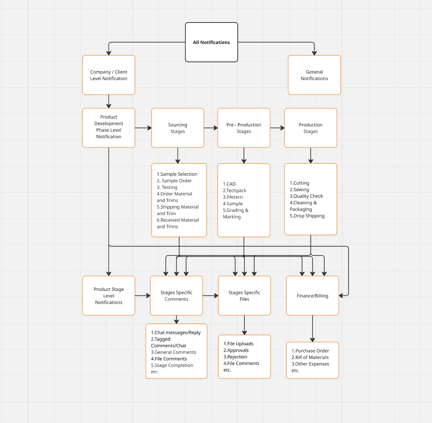
Following are the three different user flows for managing notifications for different levels Company,Product and Stage.
Testing
Usability Testing
- For usability testing, I recruited 5 participants to test the prototype. The objective of the test was to identify how easily users are able to subscribe and unsubscribe from a particular product, company, stage, or phase of the product lifecycle.
- I divided functionality into 6 different tasks to check the task completion rate and time required to complete those tasks Usability test questions .
- Usability Test Findings
- Based on the test result data some changes were made to fix issues faced by the users.
Test Completion Rate: 100%
Error-free rate: 85%
Solving the problem?: Yes
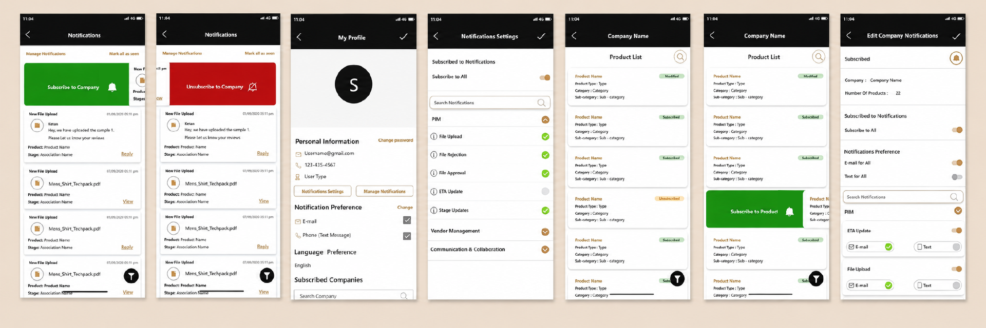
Solution
Reflection
The design did what it set out to do: users could finally control notifications at the level that matched their work company, product, and lifecycle stage and the critical alerts stopped drowning in the noise. That fed directly into fewer missed deadlines and a better client experience, which mattered for retention. But the harder lesson was that giving users control is not the same as reducing their burden. Preferences across that many levels can quietly become their own kind of overwhelm a settings screen as noisy as the feed it was meant to fix. So rather than hand users a blank grid of toggles, I leaned on role-based Notification Templates: each user group starts with a default set mapped to their job and validated against my research. Template creation lives on web; on mobile, users inherit their role's template and fine-tune it if they want. Most people get the right notifications without ever opening settings control is there for the ones who need it.