Affiliate Website Redesign
Redesigning a legacy application
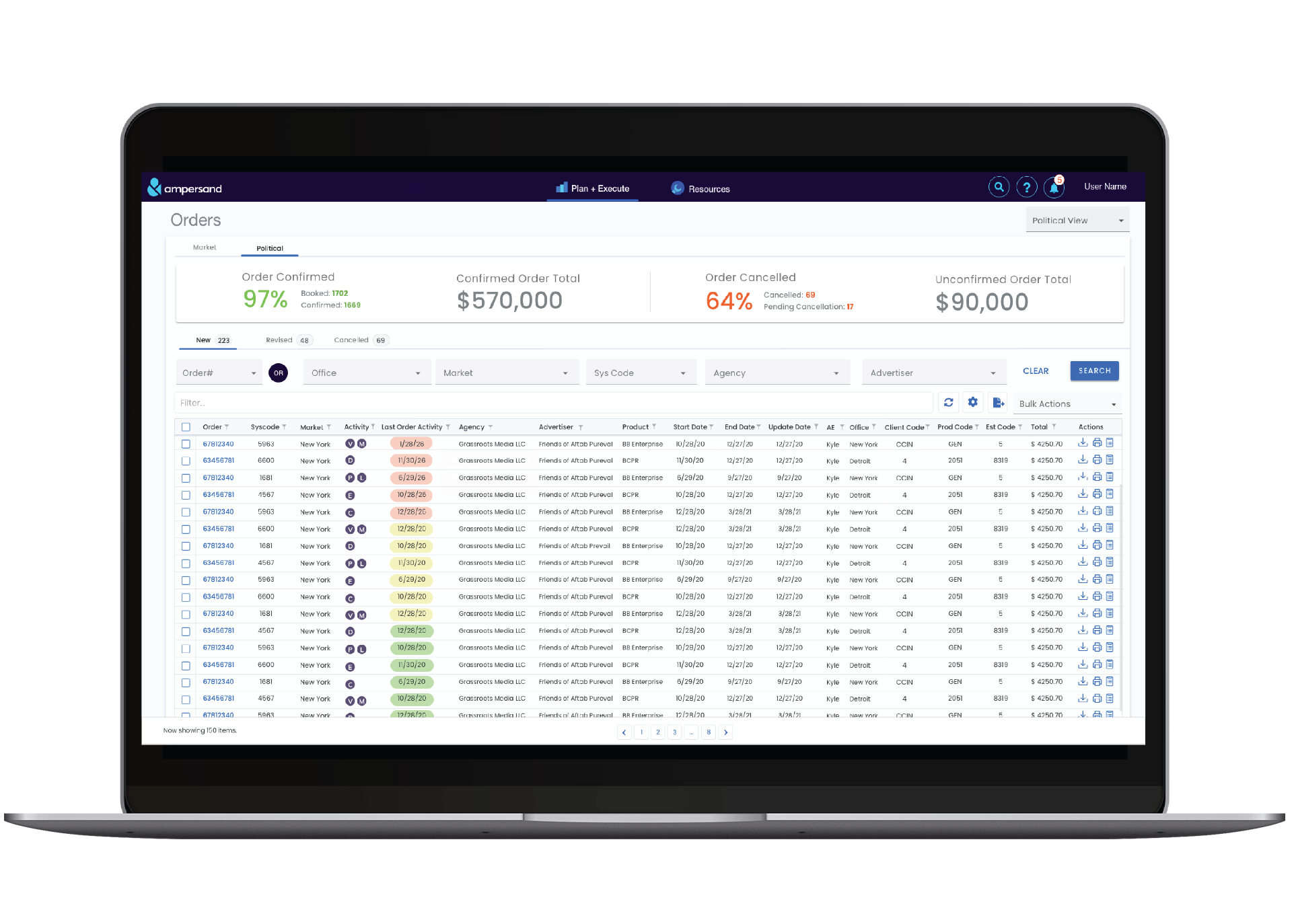
IMPACT
At a glance
Rebuilding a 25-year-old, business-critical platform for 500+ affiliates; where the real challenge wasn't a better tool, but adoption from users who'd normalized every workaround.
92%
Task Success Rate
78%
Manual refresh dropped significantly
$0
No business lost till the date since the release
8
Functionalities Fixed No More Workarounds
2x ↑
Faster loading time than earlier
Role
Lead Product Designer (Sole)
Timeframe
3 Months
Tools
Survey Monkey, Claude, Microsoft Clarity, Power BI, Microsoft Azure, Teams, Adobe XD
Tasks Performed
End-to-End Design, User Research, Workshop Facilitation, Wireframing, Prototyping, Stakeholder buy-in, Collaboration with PM, QA, and Engineering teams.
Overview
Context
Ampersand is a multiscreen advanced TV advertising company empowering brands to reach audiences with precision at scale.Ampersand is jointly owned by the largest cable operators in the US which are Comcast, COX, Charter.The cross-screen, data-driven solutions, powered by America’s largest TV inventory and largest set of data viewership insights, are revolutionizing TV planning, buying and measurement. There three lines of business National, Local and Addressable.
Introduction
Affiliates - the partner networks who buy and transact against that inventory run their daily business through Ampersand's online portal: pulling rate cards, placing orders, and tracking yield. The portal was 25 years old, and its codebase was frozen, no fix could ship without a full rebuild. Over the years, workarounds had hardened into the way affiliates worked. The Goal is to rebuild a business-critical tool that 500+ affiliates depend on daily, without disrupting a single day of their work in the transition.
Research
Survey
A survey was sent to all affiliates. It included questions about the old application they currently use, to understand how critical it is for different job profiles, how they rate the current website, and to identify their pain points and areas for improvement. Open-Ended Questions 1. Do you use workarounds to get your job done? 2. What new features would make the site more valuable? 3. Please share your feedback, additional comments, or suggestions. The total number of responses we got for the survey was 128. The major issues that emerged from the open-ended question responses are as follows: 1. Speed & stability — platform speed, and speed for processing large orders (known issue). 2. Makegood processing and synchronization. 3. Order revisions history. 4. Searching and filtering not holding. 5. Redundancy and confusion due to poor naming conventions. 6. Broken functionalities / workarounds. 7. Automation of manual tasks. 8. Issues related to file exports.
Design Thinking Workshop
Planning
This workshop was not a typical design thinking workshop. It was customized based on the project and the available information to make the most of the one and a half days we had. I designed and facilitated a 1.5-day workshop with 8 stakeholders across leadership, product, and engineering. Deliberately front-loading the survey data so we prioritized from evidence, not opinion.
Empathize & Define
The workshop started with a walkthrough of the Affiliate website and the problems with the site. We defined the personas and went through survey responses.
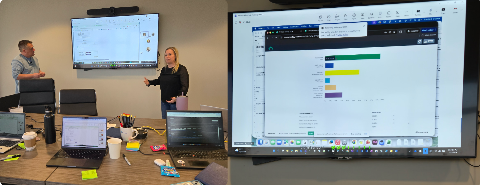
Why redesign?
My first step before starting any project is to understand: why are we doing this project? So I asked the same question to the Product Manager and the Stakeholders. The reasons the affiliate website needs to be redesigned are as follows.
Problems to Opportunity
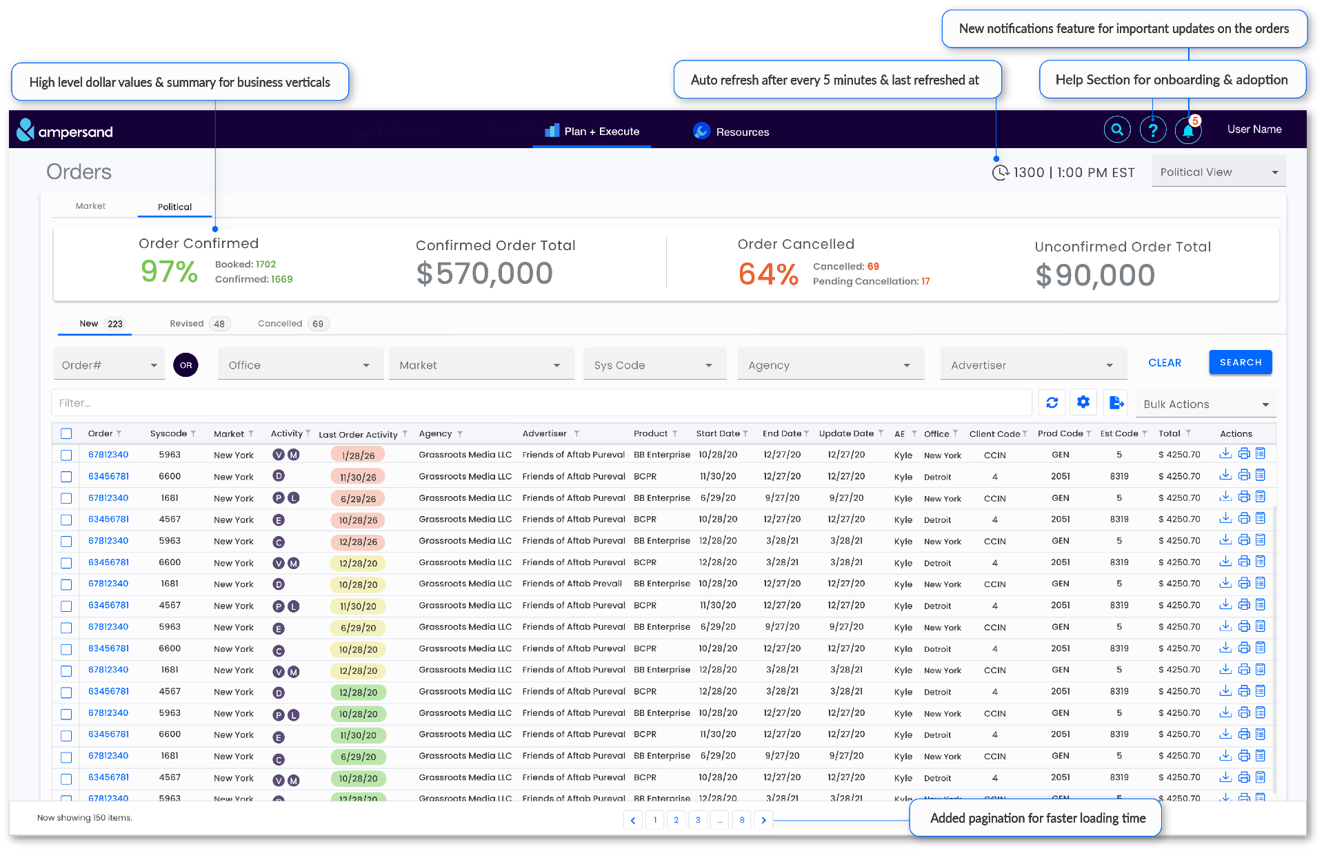
The codebase was too old, no fix could ship without a full rebuild. That constraint reframed the brief: this wasn't a UI refresh, it was a chance to rethink workflows that had calcified around a broken tool for 25 years. The rebuild let us tackle six things at once: A dated UI/UX → rebuild the experience around how affiliates actually work today, not the conventions of 2005. Slow and clunky performance → a modern stack fast enough that the tool gets out of the user's way. Broken functionalities → restore the capabilities affiliates had learned to work around and live without. Dead features nobody used → cut them, and reclaim the space and attention for what matters. A codebase that couldn't take new functionality → a foundation built to extend, so the platform can grow instead of freeze again. Manual refreshing to catch order updates → the sharpest pain point. Affiliates were reloading the page every few minutes so they wouldn't miss an order or revision. The redesign surfaces changes live, turning a constant manual chore into a system that tells users when something moves.
Understanding User Groups
Political Sales Manager / Sales Planner
- Goal:Identify new business Frustration:Back to back order revisions, hard to track revision history & speed Tasks: 1. Track new orders 2. Track revenue 3. View order for oversight 4. Quick identification of unaccepted orders
Political Campaign Manager / Support Specialist
- Goal:Maintain makegoods business Frustration:Makegood Processing and Synchronization issue Tasks: 1. Review and Confirm 2. orders in timely manner 3. Create Makegoods 4 .Accept orders
Political & Markets Yield Team (ERC)
- Goal:Maintaining Electronic Rate cards Frustration:Time consuming workarounds due to broken functionalities Tasks: 1. Upload, View, Download rates 2. Keep rate cards up-to-date 3. Report on gaps in rate cards 4. Ensure downloaded exports and the upload template match
Admin / Super User
- Goal:Validate the affiliate site is running successfully Frustration:Manual account setup & updating Tasks: 1. Replicate all capabilities of an affiliate user 2. Troubleshoot for affiliate user 3. Identify discrepancies between Platform and affiliate site orders 4. Test deployment of affiliate site changes
Markets Campaign Manager
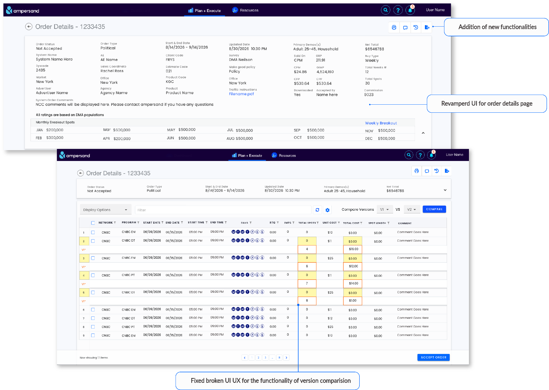
- Goal:Gather intel across both Linear and Digital orders Frustration:Version comparison broken, Exports format
- Tasks: 1. New & historical linear & digital orders 2. Calculate Total investment/total impressions 3. Coordinate with AMP Account Executives on orders/markets orders 4. Order admin reference
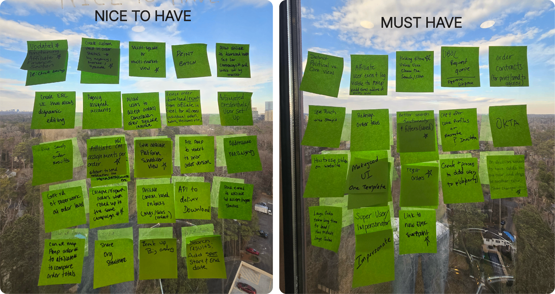
Based on the survey data we came up with themes which are important for the redesigning of the website and divided them into 2 parts 'Must have' and 'Nice to have'.
Ideate
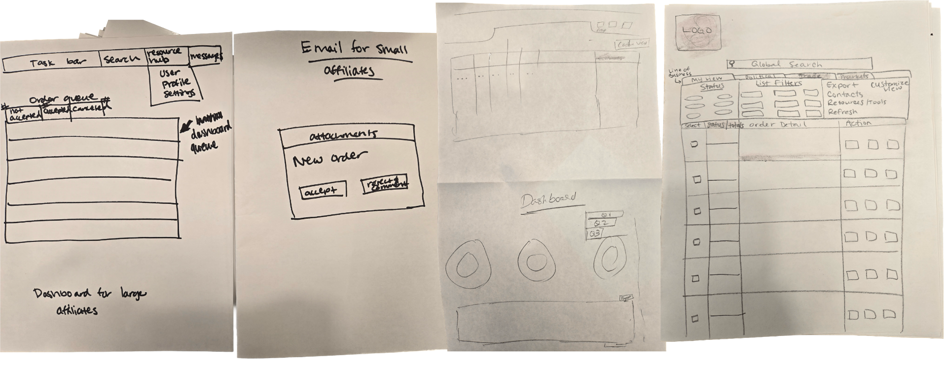
The Second day of the workshop started with sketching. To know what ideas stakeholders have in their mind for the redesign, how do they envision the website I asked them to turn their ideas into sketches and explain their sketches to get a sense of what they consider important for redesign and also to understand the design expectations.
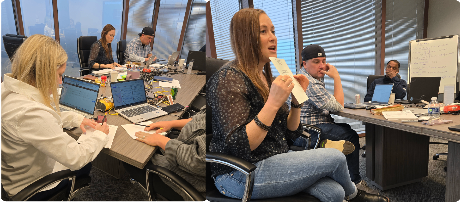
Prioritize
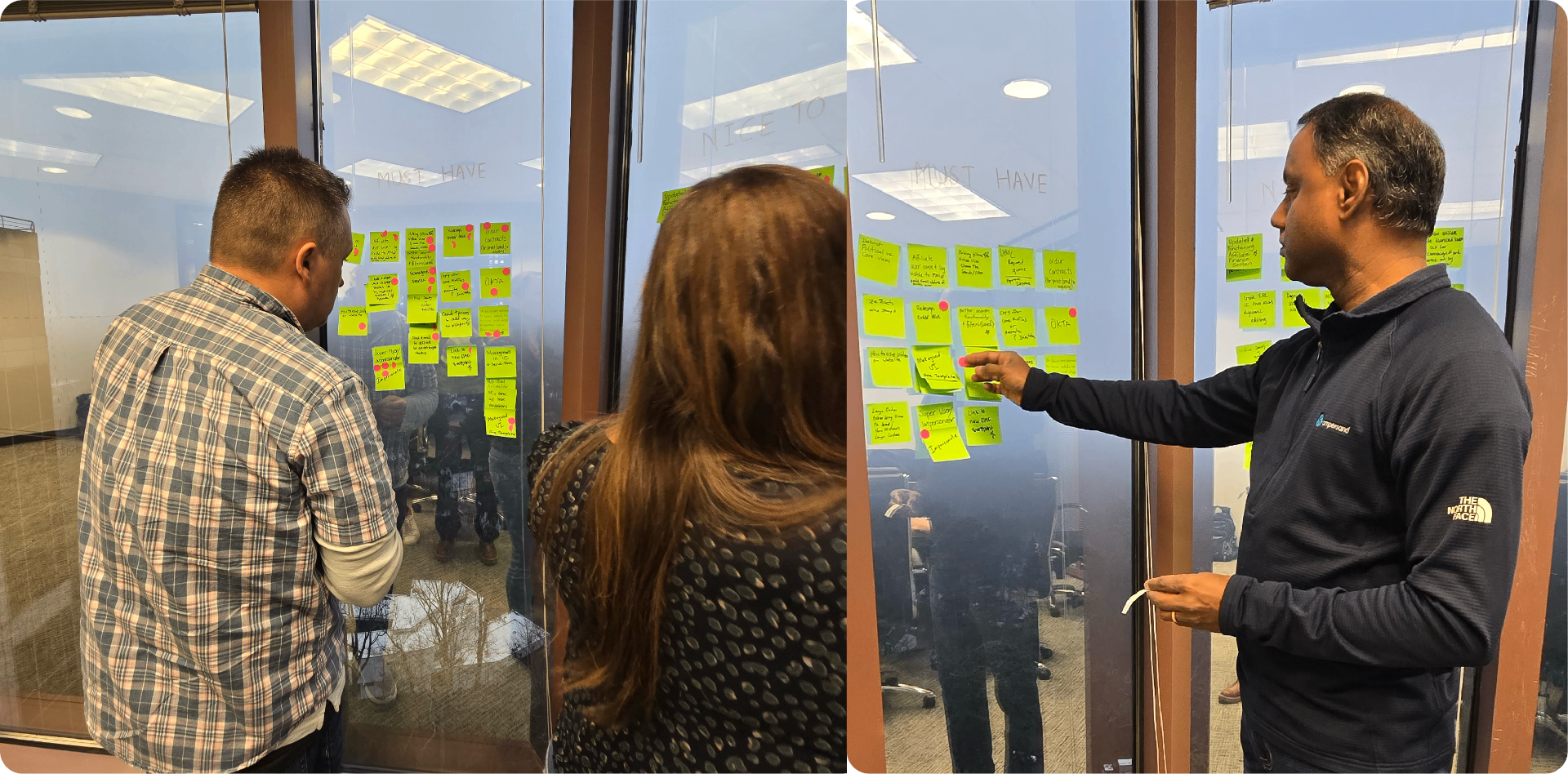
All the attendees were given an opportunity to vote — limited to 5 votes each — to get to the actually important themes. After everyone voted, I took all the sticky notes with votes and arranged them in descending order.
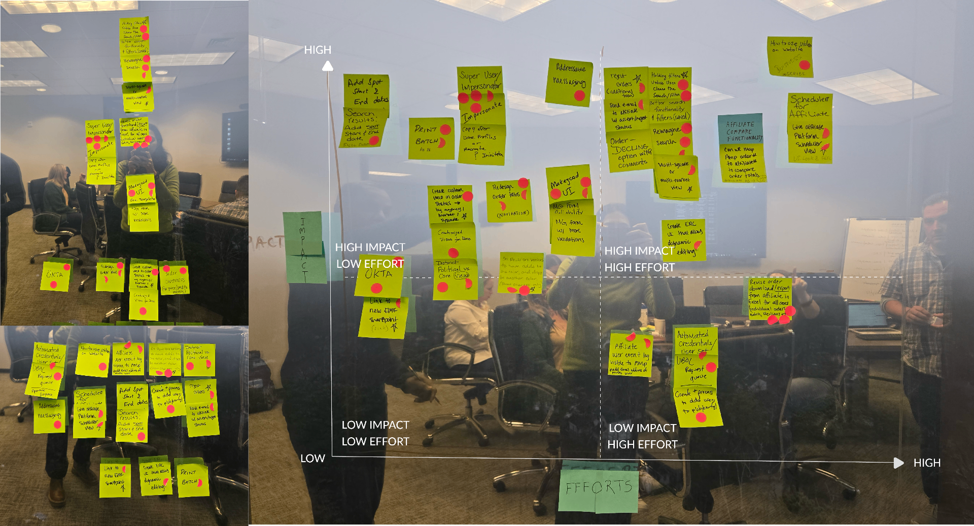
The next step was to use the Prioritization Matrix to understand the level of effort and the impact of each card, so we had clarity about which things needed to be worked on for this project.
Define Success Metrics
The final step was to define KPIs and how we would measure them. We converted themes into a prioritized, effort-vs-impact backlog and — critically — agreed on 5 success metrics before design started, so 'done' was defined up front.
| KPIs | How to measure | Frequency |
|---|---|---|
| Table stakes | Feedback & Survey | Continuous |
| Speed | Clarity, App Insight, Support | Continuous |
| Efficiency | Clarity, App Insight, Support | Continuous |
| Secured & less Technology Risks | Security Scan | Quarterly |
| Performance Tracking | Power BI | Continuous |
The Team
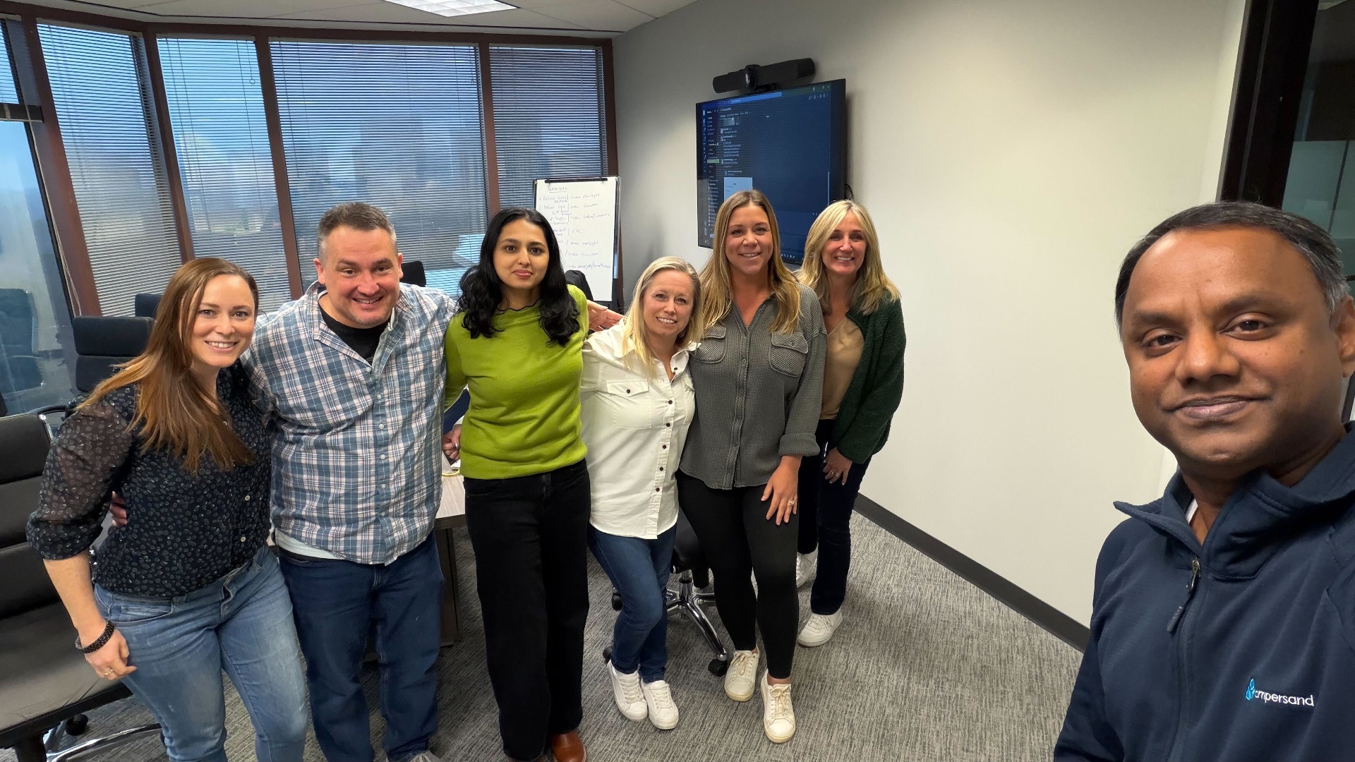
We wrapped up the one and a half day workshop with clear next steps and were ready to initiate the design phase.
Design
Sitemap
The legacy site dropped users onto a bare navigation menu with too many options and numbers that were not useful. I introduced a dashboard as the new front door and mapped every screen to be sure nothing was lost in the rebuild — with the limited amount of information I had from the survey data.
Initial Design
I presented wireframes to Stakeholders, Engineering, and the PM. We discussed the assumptions the stakeholders had. I had multiple questions about the workflow of the users — what is crucial for them to perform their day-to-day jobs on the website. The stakeholders did not have answers to most of my questions, so I pushed for a session with all the main affiliates to understand their workflow, which would provide insights and avoid any assumption-based decisions that might affect their workflow negatively or create obstacles for them.
Qualitative Research - Focus Group
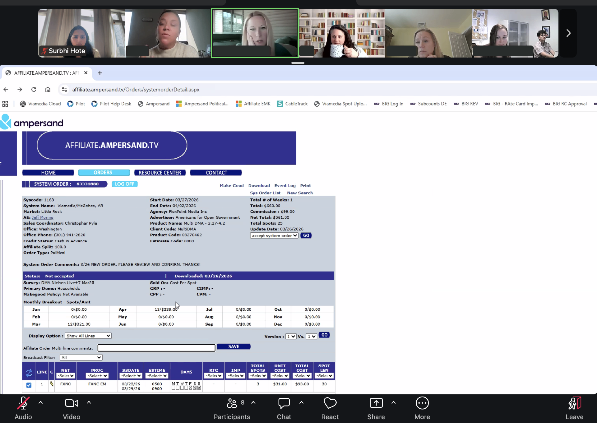
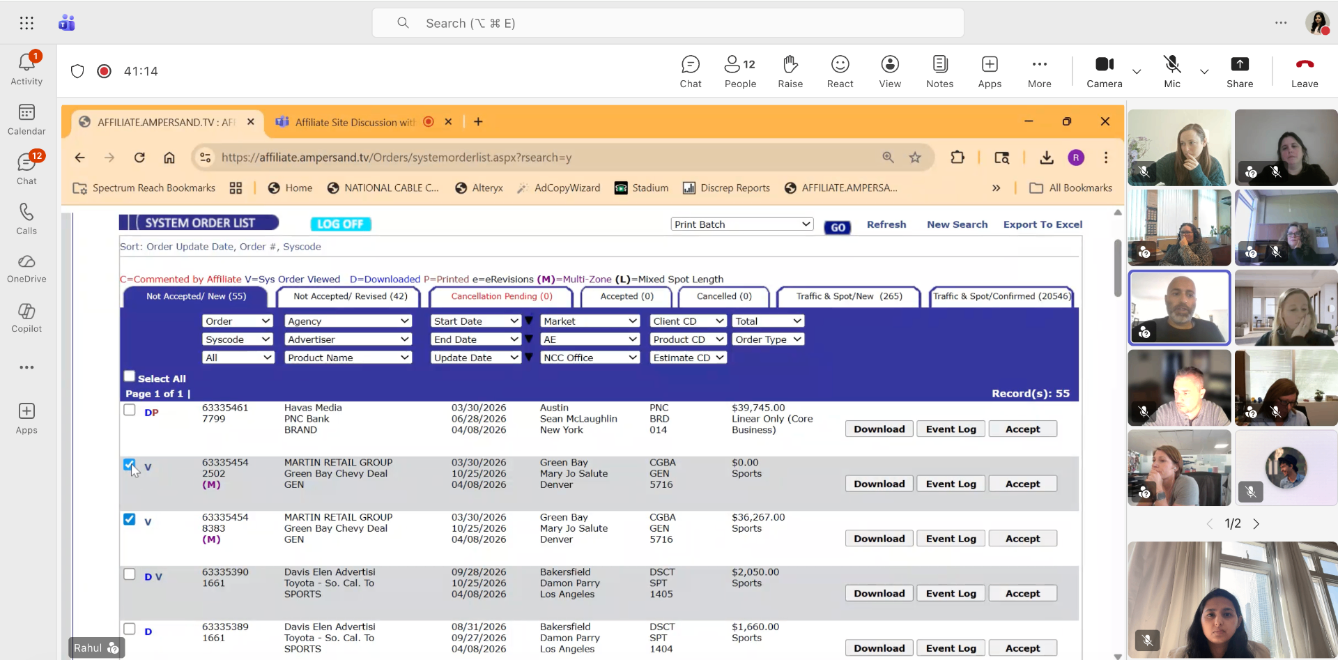
I was able to get stakeholders to arrange meetings with 5 different affiliates, each with 5–10 people from their organization. We collectively came up with the questions we wanted to ask affiliates. Click here to see the list of questions for the focus group. Watching the work overturned assumptions we'd carried into the project.
- Stakeholders assumed affiliates did not need the D, V, P, and C symbols, but in session after session these proved very important for identifying whether someone was working on an order.
- The sessions surfaced the real cost of the old system. Over recent years, affiliates had lost roughly $850K in business to orders that slipped through unnoticed there was no clear way to see whether someone was already working an order, so orders were dropped.
- Order revisions from the Ampersand side - staff sending revision after revision before affiliates could open them — caused problems for affiliates in understanding what had changed, and needed to be restricted.
Refer to the Survey Results section, you will find that we asked a question to rate the current experience of the affiliate site. The survey results surprised us that, the most respondents were satisfied, and some answered as very satisfied. During a session with one of the affiliates, they said, "We like it as it is, we don't want it to change." Because the site is very old, the users are so used to it ; even with the workarounds. Change is very hard for them after learning to operate with all the workarounds turned into user habits built over years of using the website. The hardest constraint wasn't technical. Users were satisfied because they'd normalized the workarounds, so the risk wasn't a worse tool — it was rejection of a better one. I designed for flat adoption over dramatic change.
| Phase 1 | Phase 2 |
|---|---|
| Orders and Event log | Makegood |
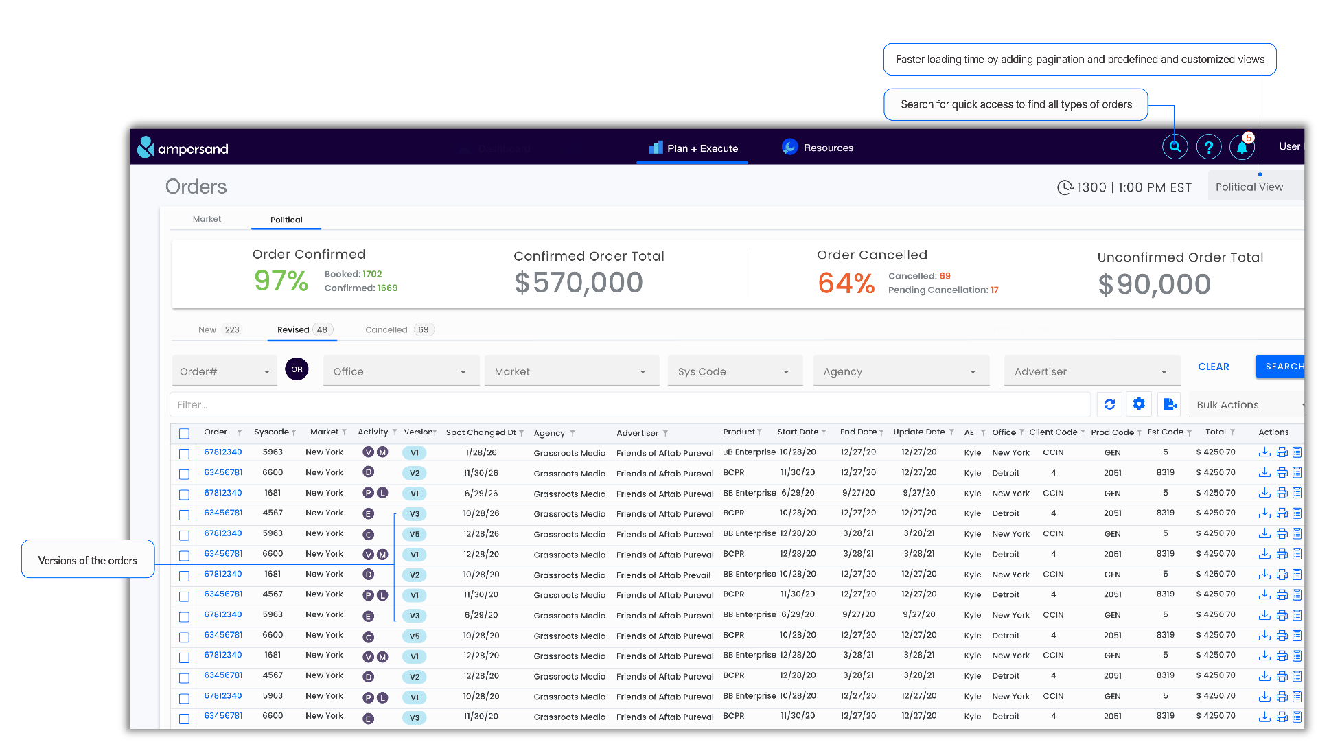
| Views, Search, Filters | Order Revision |
| Compare Order Version | Platform Notifications |
| Internal & External Rate Cards | Super User Profile |
| Speed & Efficiency | Messaging |
| Contacts & Resources,Email Notifications | Collaterals |
| Auto Refresh | Exports |
| Fix Broken Functionalities | Automation |
Testing
Usability Testing
- Formal moderated testing wasn't viable as affiliates are external and we'd already spent their goodwill on the survey and sessions.
- So, I validated adoption behaviorally with Microsoft Clarity session analysis and an in-product feedback survey after 3 months of live use.
- The feedback we got was positive, and I watched some sessions using Microsoft Clarity to check if it was being used as we expected. The results seemed satisfactory.
Adoption
Before the release, we made sure to have the help resources ready — such as short videos/tutorials showing how to perform all the tasks, a list of possible FAQs, and a place where users can send feedback and report any bugs or errors they encounter.
Solution
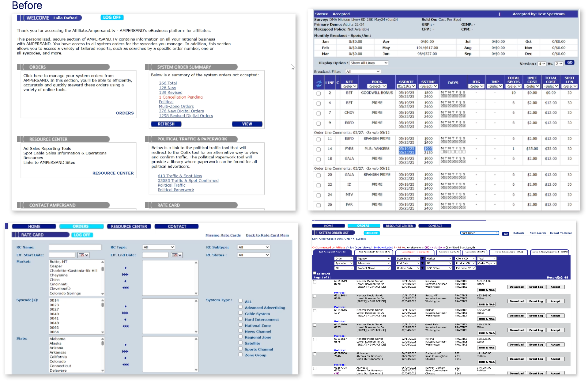
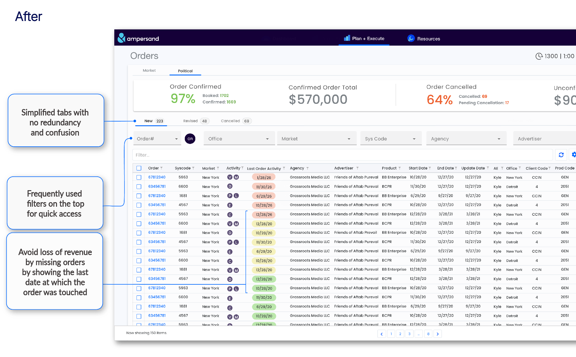
Reflection
This project was more than a redesign. We tackled the pain points that had shaped how affiliates worked for years — speed, stability, broken functionality, redundancy, and the constant manual refreshing — and rebuilt the platform on a foundation that can finally evolve. The results I'm proudest of: a 92% task success rate, the near-elimination of manual refreshing, and zero business lost since launch against the ~$850K the old system had been quietly bleeding.Designing that visibility into the new platform is precisely what the "$0 lost since launch" result protects.The biggest lesson wasn't about the interface — it was about restraint. For an entrenched user base that had normalized every workaround, the real risk wasn't building a worse tool; it was building a better one they'd reject. Designing for flat adoption meant deliberately deferring improvements I'd have liked to ship on day one. Phase two, now in development, including a major shift in how affiliates communicate on the platform.
Interested in more?
Interested in more? Contact me for the case studies with additional insights and artifacts.